Hello again! I’ll start off today’s post by repeating the most important phrase from last week’s video: There’s no sense in trying to sell something online if the photo you use is uninteresting. You need people to want your item so badly, that they’re willing to forgo holding it or trying it on. Your product photo needs to do the same work of a face to face encounter, and it has to do it in seconds while people scroll past it.
To this end, I’m creating a few short videos outlining some very basic principles of photography. I’ll be talking about product photography for now, but the information is good for any type of photography. Good photographers know how to bend light to their will. Make the best of any situation. Whether you’re photographing a coffee mug or a baby, it’s all the same.
Lesson 1 was the Magic of a Patio Door, and contrary to my confidence level when posting it, I’ve heard some good feedback on it. Yay me? Honestly, if the videos help you at all, I’m happy 🙂
In Lesson 2, I’ve moved into the living room (ooooo!) to use some benches near a large window. As I state in the video, your light source doesn’t need to be this large – mine just happens to be. You might need to move your product closer to a smaller light source or raise your item up with a box or a chair, or even a box ON a chair… do whatever you need to do to position your product in the best possible lighting situation.


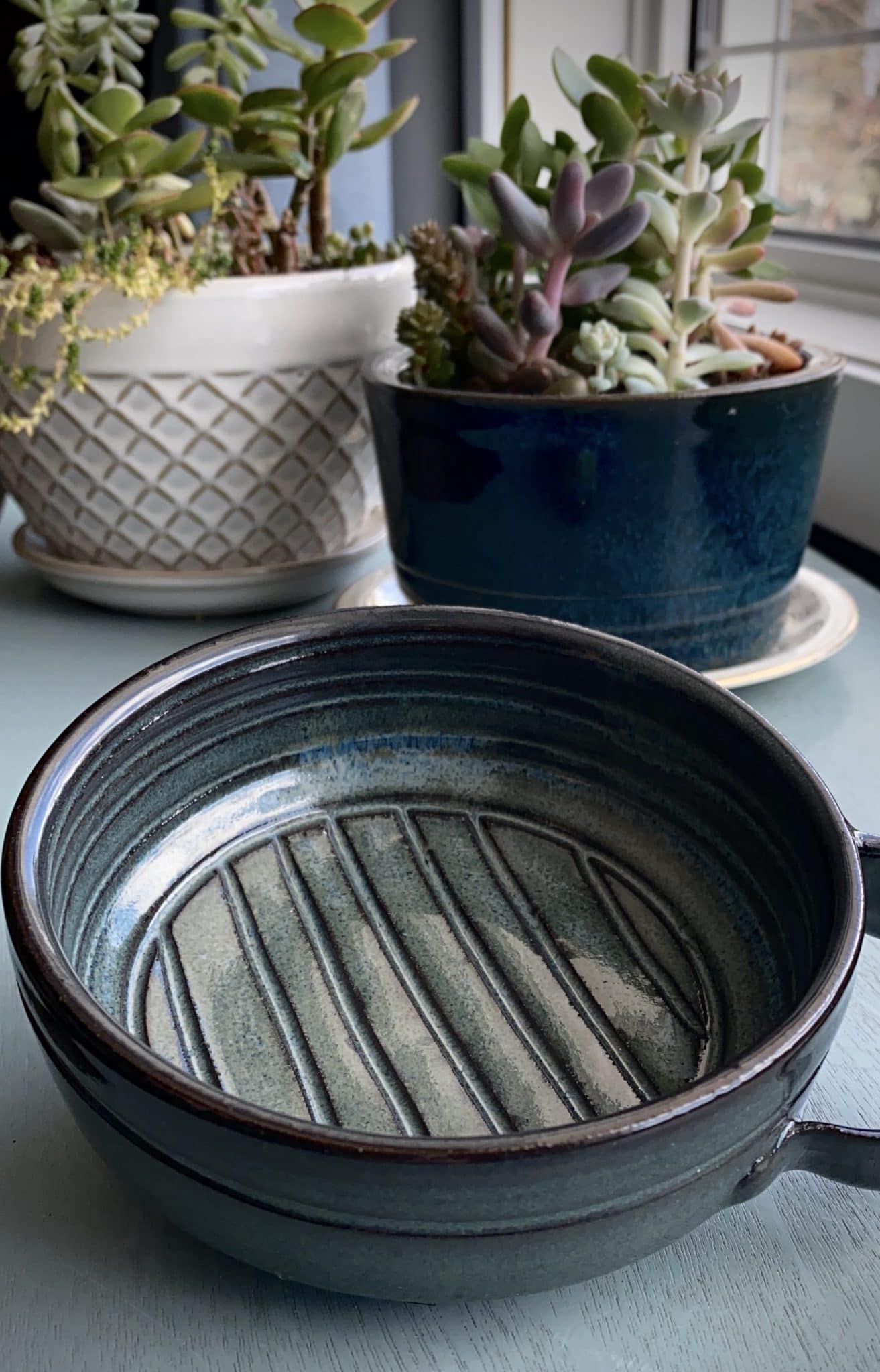
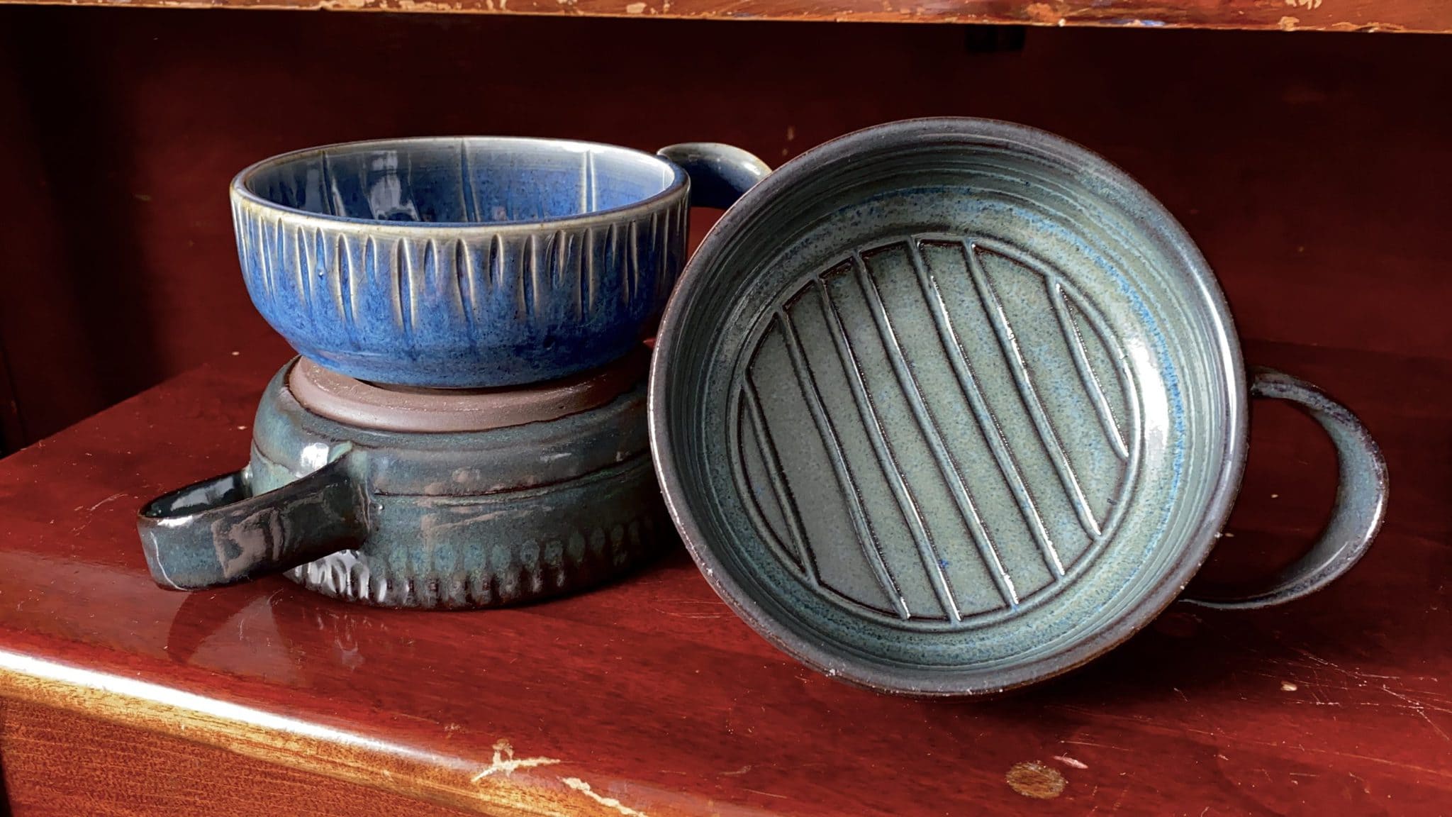
I’ve tried to talk you through a couple of different shooting variations in this video. Coincidentally, I chose the same bowl to feature in each of the setups. See how different it looks from one shot to the next?? That’s what lighting can do. When in doubt, photograph your product in multiple locations until you achieve the look you’re after. And on that note, you should try to shoot with intention when you’re photographing a product. What are you trying to sell? What emotion are you trying to evoke? Do you want your item to feel moody and high end, or do you want it to be bright and light and cheerful?
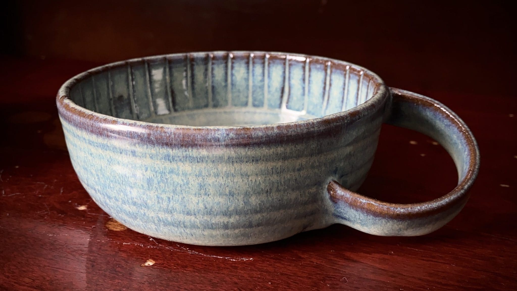
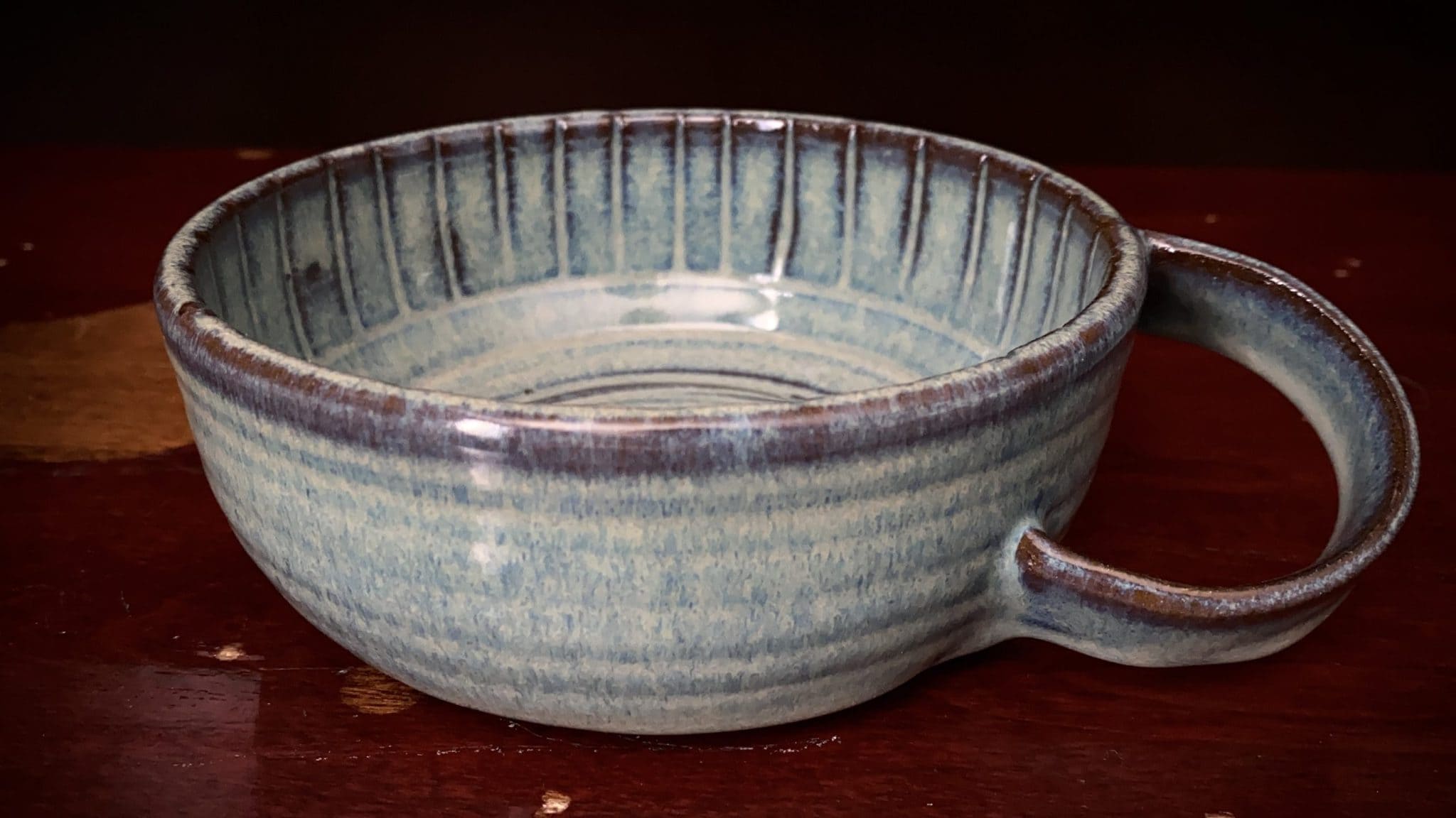
I had the presence of mind while shooting this video to show you a comparison between having the blinds open (top photo) and having them closed (bottom photo.) Note the temperature shift on the second photo. Daylight is generally cool in temperature, while indoor/artificial light tends to lean yellow or even green (in the case of fluorescents.) Always consider this when you’re choosing where to do your photos. You might not be showing your product in it’s true colours. (Some of this is easy to correct in post production, but I’ve kept edits to a minimum for the sake of these examples.) Both photos are sharp, relatively competent photos. Both have a proper exposure and both show some detail on the bowl. But the second photo is a snooze-fest and I, for one, would never spend money on that bowl. It’s that fast. It’s either “see it – wow! – want it – buy it” or “see it – yawn – what’s new on facebook this afternoon?” You get seconds of interest, so you need to grab the viewer with an interesting photo


**Once again, I have had some after-the-fact realizations about my video**
- Combining vertical and horizontal videos into one finished product is freaking annoying and I won’t be attempting it again. Lesson VERY learned and I’m sorry you have to go through it with me.
- I started the video by saying “we won’t need to be crawling around on the floor!” and then proceeded to crawl around on the floor. What can I say – inspiration hit me and my plans for finding a tall surface vanished. I’ll do legit table top next time. I promise.
- That “turn around while watching the light on your face” trick works for when you want to photograph your kids too. They usually don’t have the stamina or patience to do photos in several locations, so do the work yourself at the start. Pick the nicest lighting using yourself as a test, and set the kids in that spot.
